How to make graphs in Excel

Charts in Excel
What is a chart in Excel?
Just as they say “a picture says more than a thousand words”, a good graph says more than a table with thousands of data. Working with data and knowing how to represent it clearly and orderly in a graph is key to summarizing information and achieving your objectives. Charts in Excel are very useful tools for anyone: from your personal finances to a monthly report at work.
What are graphs for in Excel?
Communicate information as quickly and efficiently as possible. Whenever we make changes to a graph we must take that into account. When making a graph in Excel we must try to minimize the “noise” of the graph, that is, eliminate elements that do not add value to convey our objective.
How to make graphs in Excel?
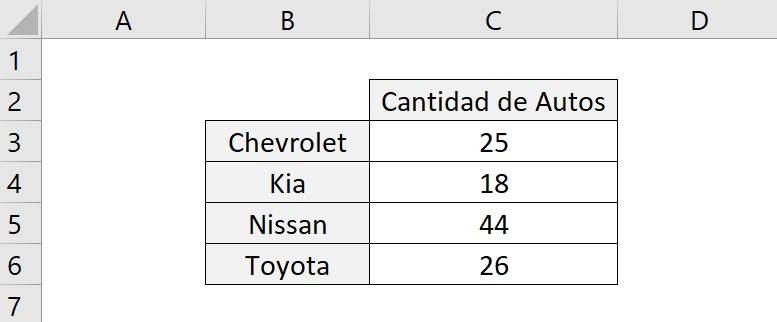
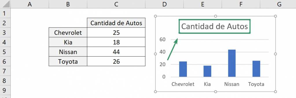
Let's consider a database with the quantities of cars each brand has:
Then, to make the graph, follow the following steps:
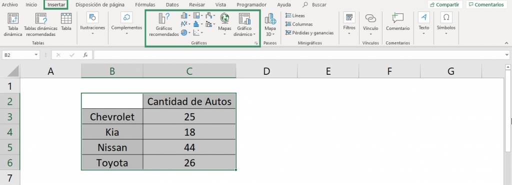
- Select the database range.
- Select the “Insert” tab and then in the “Graphics” group click on “Recommended Graphics”.
- Select the type of graph that best suits you, in general Excel's recommendations are very accurate. If you can't find it in the recommendations, go to the type of chart you're specifically looking for.
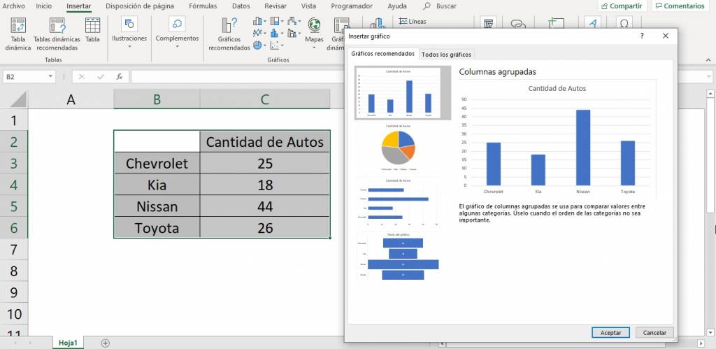
- Ready! You already made your first graph. In this case we choose a column chart because it clearly shows our data.
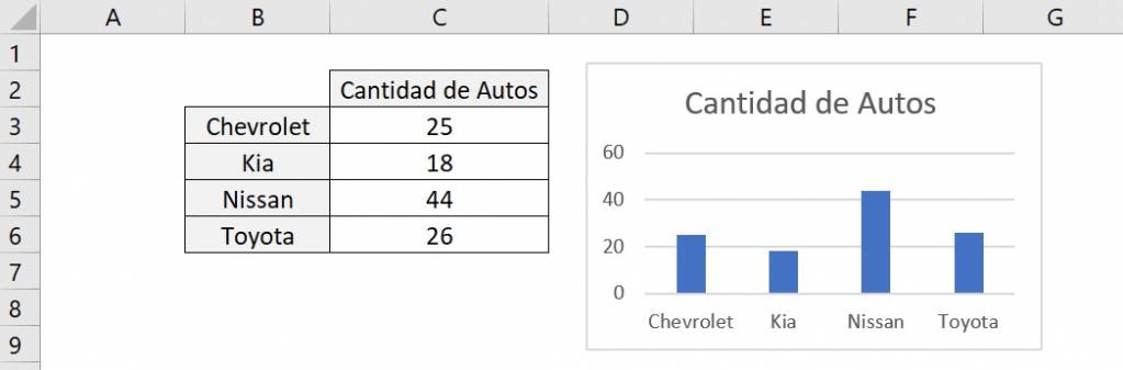
Note that the graph is on top of the spreadsheet and the data, so we can move it wherever we want and give it the size and dimensions that we deem most convenient. You can also move the graph to another sheet or spreadsheet and it will remain “tied” to the data.
Ninja Tip: You can replace step 2 with the shortcut Alt+F1 on Windows and Fn+Alt+F1 on Mac and the chart will be created with the first Excel recommendation.
To complement the general idea of graphs and how to make your first graph you can watch this video:
Types of graphs in Excel
Next, we will explain the different types of charts you can create in Excel.
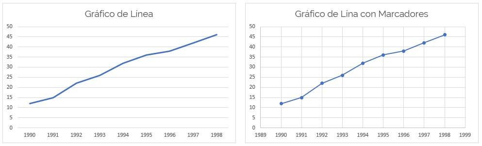
Line Chart
The line graphs show a series as a set of points connected by a single line. They allow trends or changes to be identified over time. This graph is recommended when we have any time reference such as days, years, months, hours, etc.
To this type of graph we can add markers to the values to identify them more easily.
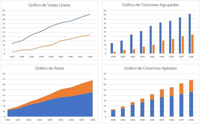
Comparative Charts
If we have several series within a time range, we can make a graph with several series. This type allows us to compare the trend of the different series. To compare, we can use different types of charts, such as multiple lines, grouped or stacked columns, area charts, among others.
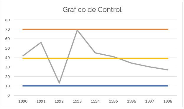
control chart
A control chart is a diagram used to examine whether a process is in a stable condition, or to ensure that it remains in that condition. The structure of the graph contains a “center line” (LC), an upper line that marks the “upper limit of control” (LSC) and a lower line that marks the “lower limit of control” (LIC). These control limits mark the confidence interval within which the points are expected to fall.
This type of graph is used to determine the control status of a process, diagnose the behavior of a process over time, indicate whether a process has improved or worsened, and is used to detect problems.
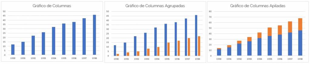
Bar or column chart
Bar or column charts are a way to easily represent one or more numerical series through several bars of the same width, each of which represents a category of data. Therefore, the height of the bar will depend on the size of the value.
This type of graph allows you to graph one or more data series through different formats.
Column charts are characterized by representing data in vertical columns, whereas bar charts represent data through horizontal columns.
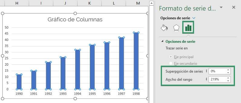
Useful formatting edits for column charts are the width of the bars and the width of the gap. To do this, we double-click on any column and in the “Series Options” section we choose the “Series Overlay” item to define how far apart or together the columns are. In this example we will leave it at 0% which means that the columns remain together, without separation.
We can also adjust “Range Width” to define the width of the columns. In this example we will leave the width at 100%.
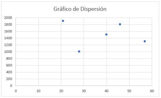
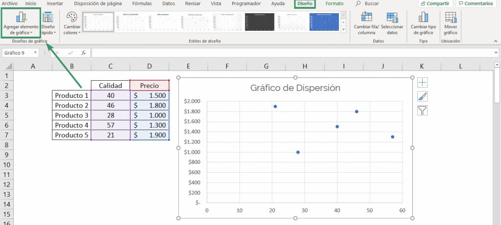
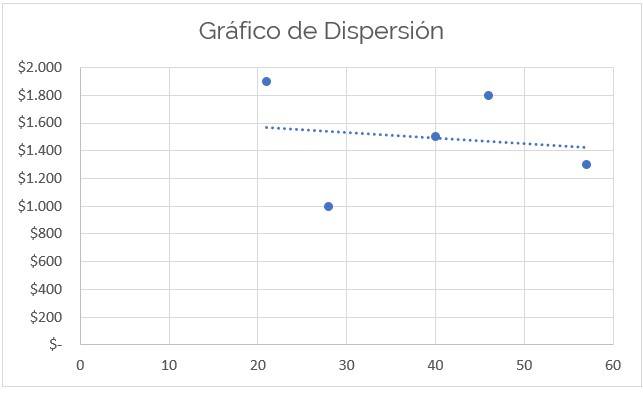
Scatter or dot plot
The scatter graph consists of the graphic representation of a series of coordinates based on two variables, that is, we analyze the relationship between both variables, knowing how much they affect each other or how independent they are from each other. This type of graph is useful for comparing a data set with two different characteristics, such as price and quality, where each variable is represented on each axis.
In this type of charts it is very useful to add a trend line. This is a line that summarizes the behavior of the data and shows you the relationship between the two variables. This line is the result of a linear regression.
To incorporate this line we must:
- Go to the “Chart Design” tab and click on “Add Chart Element”.
- Then, we select “Trend Line” and the type of line we want. In this case we want a “Linear” because the relationship looks like a straight line.
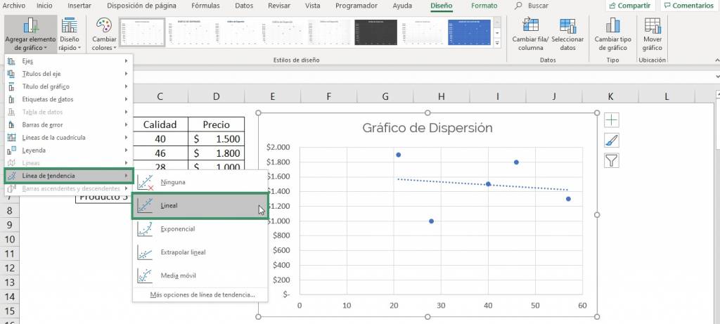
- Click “Accept” and that's it!
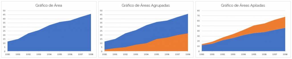
Area Chart
The area chart is a chart in which the area between the line and the axis is shaded with a color. These charts are generally used to represent cumulative totals over time. This type of graph allows you to graph one or more data series in order to compare volumes.
Pie chart
The pie chart is one of the most used types of graphics because it very simply represents the proportion of a series of values to the total. This graph automatically converts values into percentages allowing easy and comfortable viewing.
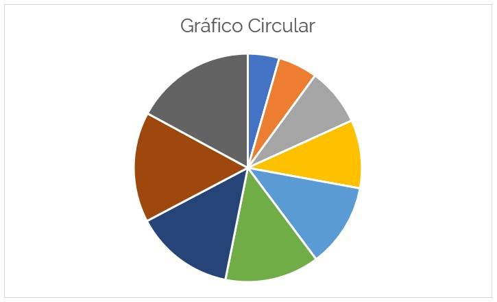
Ninja Tip: In this type of graph it is very useful to add data labels that include both the value of the variable and the percentage of the total that they represent.
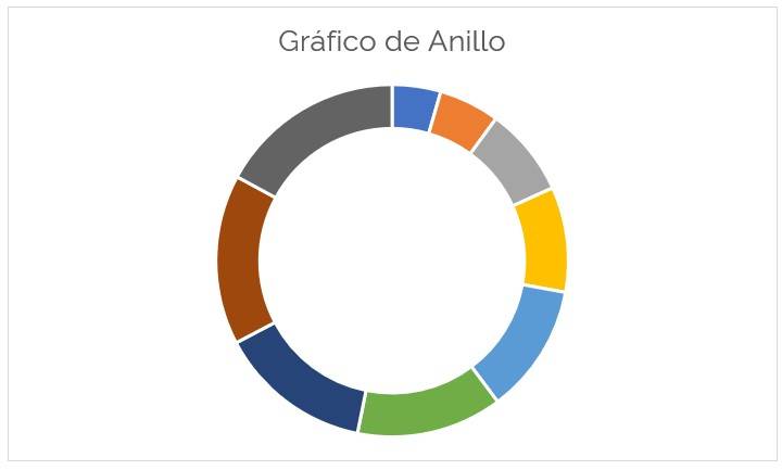
Donut Chart
The pie chart is a variation of the pie chart, both represent the percentages of each value with respect to the total. This type of graphic is increasingly used due to the aesthetics and modernity it provides visually.
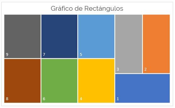
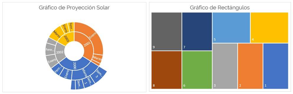
Rectangle chart
A rectangle chart provides a hierarchical view of the data and makes it easy to locate patterns. This tree-structured hierarchical form represents each branch with a given rectangle, which is tiled with smaller rectangles representing secondary branches.
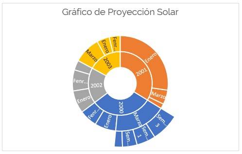
Solar Projection Chart
The solar projection chart is used to display hierarchical data where each level of hierarchy is represented by a ring or circle, with the inner circle being the highest in hierarchy. A solar projection chart without hierarchical data is similar to a donut chart. However, if there are different categories, the solar projection graph shows how the outer rings relate to the inner rings.
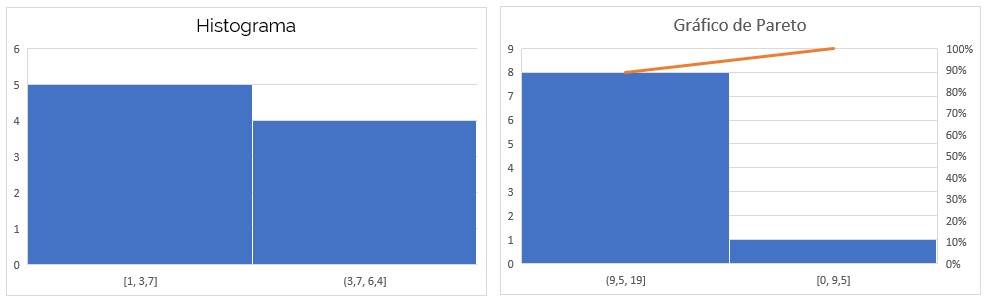
Histogram
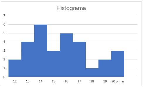
A histogram is a graphical representation in the form of vertical bars of the database. This graph is used to represent continuous databases, that is, data with intervals. They are used to obtain an overview of the distribution of the data. The height of the bars is proportional to the absolute or relative frequency of the data intervals.
Box and Whisker Plot
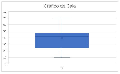
The box plot is used to represent a quantitative variable that, through quartiles, shows what the distribution is like, its degree of asymmetry, extreme values, the position of the median, and outliers.
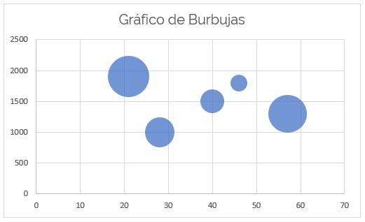
bubble chart
A bubble chart is a variation of a scatter chart in which the data points are replaced by bubbles and a third variable is represented. This type of graph represents the vertical and horizontal axes of values. Therefore, it allows for a better comparison than the scatter plot, for example, of price, quality and size.
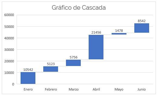
waterfall chart
The waterfall chart helps visualize the contribution that each piece of data makes to the total, that is, it shows whether it increased, decreased or remained the same. It is characterized by having “floating” columns.
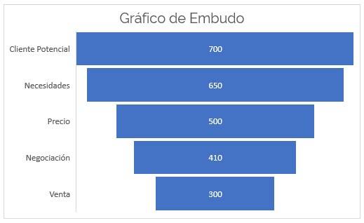
funnel chart
The funnel chart shows values through different phases of a process. Normally the values are distributed gradually, allowing the bars to resemble a funnel.
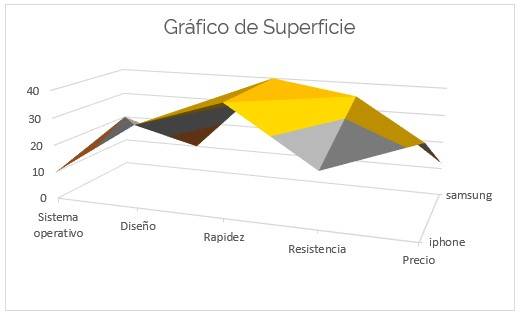
Surface graph
The surface chart allows multiple data series to be plotted in a 3D chart, with different colors for greater understanding. This type of graph is useful when looking for optimal combinations between different data sets.
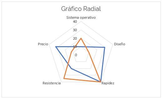
Radial or spider chart
The radial chart allows you to compare multiple quantitative variables from different data series. Each variable is provided with an axis that starts in the center, which allows differentiating between similar and different aspects between the series.
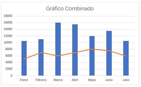
Combined Chart
Combo charts allow you to combine two types of charts into one to emphasize similarities or differences between data series. It is normally used to compare completely different variables.
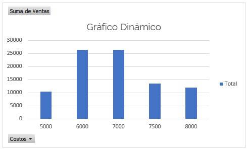
dynamic graph
Pivot charts use a pivot table as a database, therefore, when you modify the data, the changes will automatically be reflected in the chart.
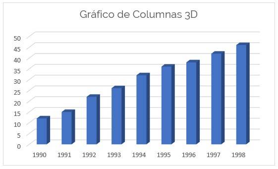
3D graph
Most of the types of graphics that Excel offers can be made in 3D, that is, giving relief to shapes. This feature allows the graphics to look more modern. In the next photo we see a 3D bar graph.
Statistical graph
The statistical graphs that Excel offers are two, the histogram and the Pareto chart. The histogram shows the absolute frequency of the data, however, the Pareto chart is made up of a histogram plus a line that shows the behavior of the accumulated values.
Hierarchy Charts
Hierarchy charts allow you to quickly view values that stand out from the rest of the data. There are two types of graphs that show the hierarchy, the rectangle graph and the solar projection graph.
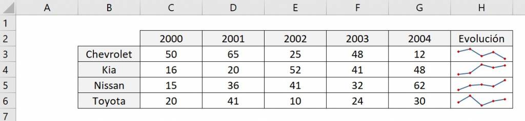
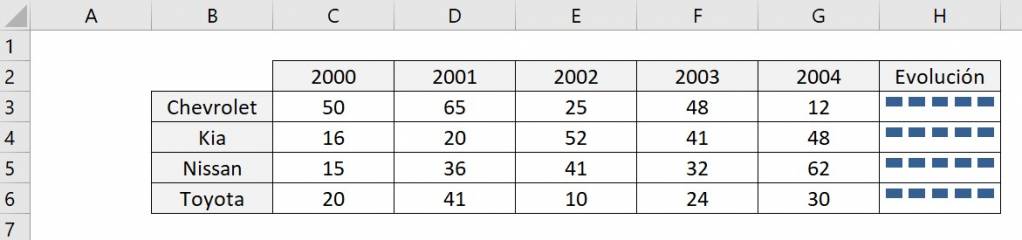
Sparkline in Excel
A sparkline is a small graph located in a spreadsheet cell providing a quick visual representation of the trend of the data.
To create a sparkline in a cell follow these steps:
- Select the cell where you want the sparkline to be located.
- In the “Insert” tab, in the “Sparkline” section, click on the sparkline that best suits you. In this case we will choose the line sparkline.
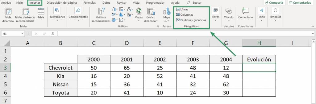
- In the dialog box, choose the data range that the sparkline will use and click “OK.”
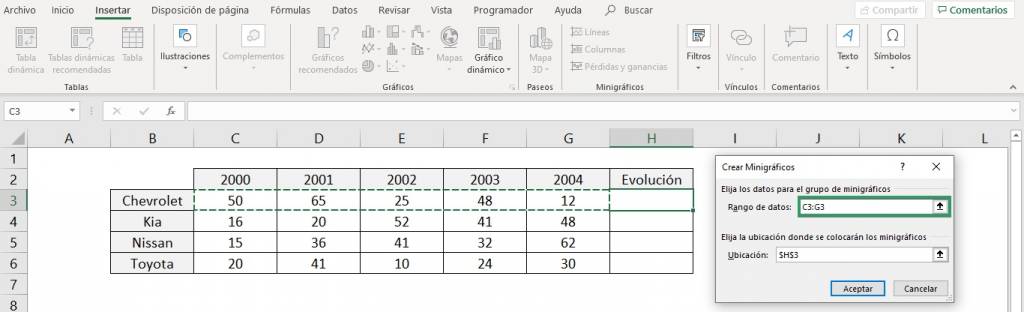
- Make a sparkline for each category and that's it! You already have your sparklines
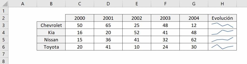
Line sparklines
To have a better analysis you can mark the points for each of the data in the series.
Column sparklines
Similar to the line chart as it also shows the trend of the data.
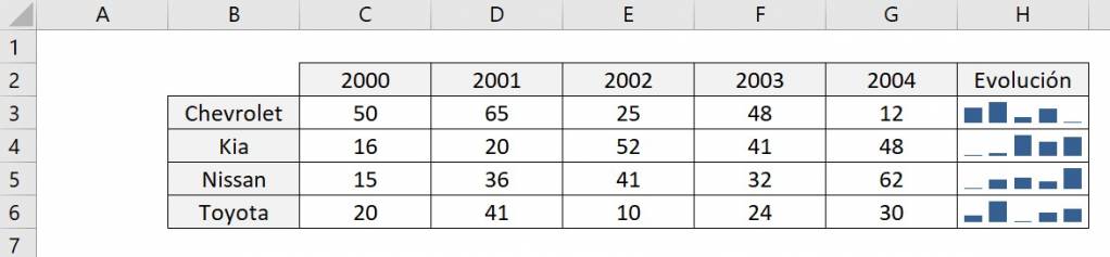
Profit and Loss Sparkline
It shows if the value is positive or negative, if it is gain the color will be blue, however, if it is loss, it will be red. In our example we do not have negative values so all the blocks are blue.
How to insert a map in Excel?
To insert a map in Excel you must use the map chart, it is used to compare values and display categories in geographic regions, such as regions or countries.
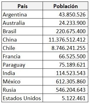
Let's imagine that we have the following database of the population of some countries in the world.
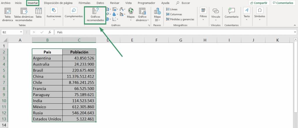
We want to graph this data on a map, for this, we must follow the following steps:
- Select the database and in the “Insert” tab click on “Recommended graphics”.
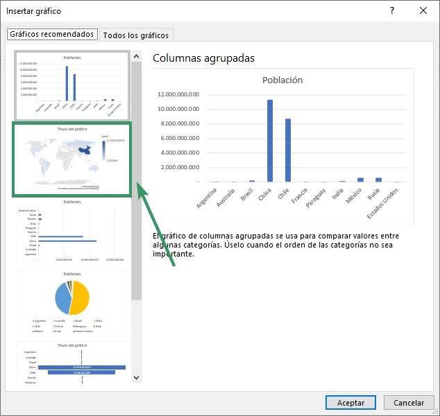
- In the dialog box, select the map graphic that appears, then click “OK.”
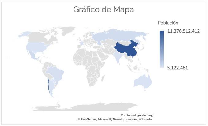
- Ready! You have now created your first map graphic.
How to insert a timeline in Excel?
The pivot table timeline allows you to quickly filter by date and time and zoom in on the period you want with a slider over time.
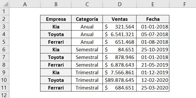
Let's assume the following database:
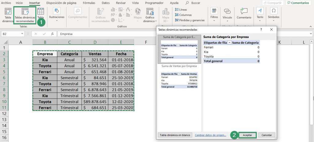
To create the timeline you must follow the following steps:
- Select the database, in the “Insert” tab click on “Recommended pivot tables” and click “OK”.
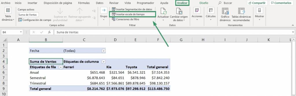
- Modify the pivot table according to your needs, but you must insert the dates in the “Filters”.

- Position yourself anywhere in the pivot table and in the “Analyze” tab click on “Insert timeline”.
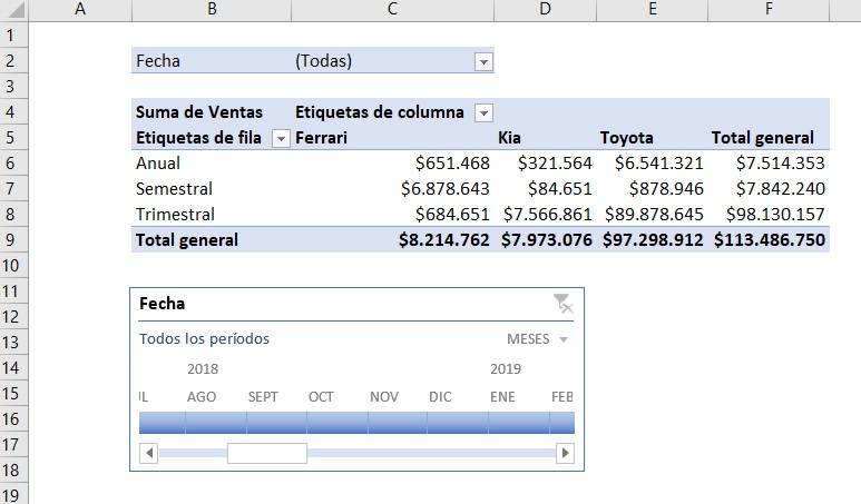
- Ready! You have now created your first timeline. Now you can see sales according to the selected date.
Conclusions
Charts are a fundamental Excel tool since they allow you to visually and quickly represent a database. In addition, Excel has a great diversity of types of graphs, making it a widely used and complete tool.
Frequent questions
How to make a percentage graph in Excel?
As we saw previously, the graphs that reflect the percentages of a database with respect to the total are pie charts or donut charts. Both graphs automatically assign the percentage that corresponds to each category.
What is a multiple chart in Excel?
A multiple chart or combined chart is to unite two types of charts into one, generally the column chart and the line chart are used to represent different data series.
What formats can you modify in a chart in Excel?
To achieve a complete and professional graph, you can modify it:
- The title: To change it, click on the title and you can edit it your way. You can also make the title equal to a cell, for this you must click on the title and write “=” plus the cell we want in the function line.
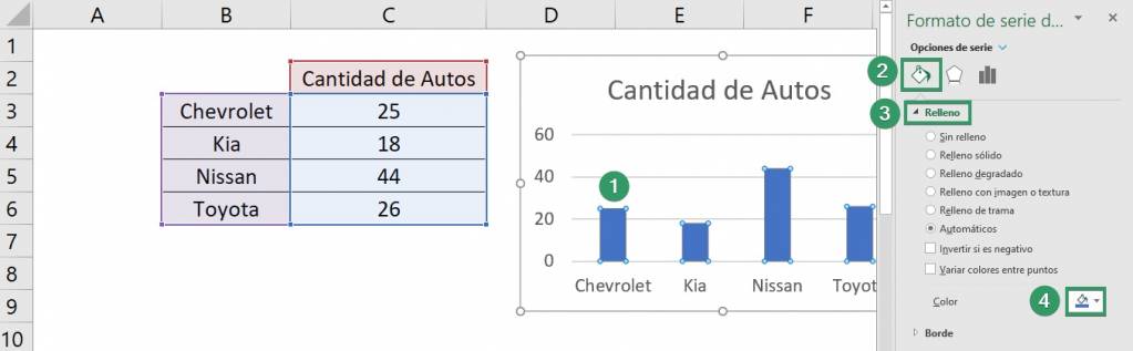
- Colors: Right click on one of the columns and select the option “Format data series” then, we click on the paint jar that indicates “Fill and line” and in the “Fill” section you can choose the color that you want. you want.
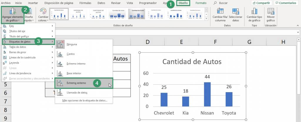
- Data label: Click on the chart and in the “Chart Design” tab, click on “Add element to chart” then select “Data Label” and select “External End” so that they appear outside each bar.
Editing other aspects: Sometimes the format that Excel gives to graphs is not our favorite. To edit any aspect that we don't like, we can double click on it and open the side menu to edit it to our liking. You can edit:
- The overall graph
- Title
- Axis titles
- The axes (vertical and horizontal)
- All series
- The legend
- Plot area
- Division lines
- Any other aspect of the chart that you can see
To see another example of graphics editing you can watch the following videos:

Frequent questions
You must select a cell in the table 2. Then INSERT > PivotChart 3. Click OK
Go to data for the chart 2. Click Insert > Recommended Charts 3. Choose your preferred chart 5. Click OK.
Select the cell range 2. Click INSERT > RECOMMENDED CHART 3. Select the chart type 4. Click OK. And ready!
1. Column and bar chart
2. Hierarchy chart
3. Waterfall Chart
4. Line chart
5. Area chart
6. Statistics graph
7. Pie and donut chart
8. Scatter and bubble chart
9. Surface or radial graph
10. Combo Chart
