Bar chart: What is it and how to make one in Excel?

A bar chart is one of the simplest ways to present data in graphs. Without this type of representation, it would be very difficult to read highly complex data. Imagine for a moment. You are in a forest surrounded by numbers and percentages like trees, flowers or plants. All of different species. You have a thousand ways to classify them. Diameter, height, bark, crown size, leaf color and so on we can go on infinity.
The bar chart can turn a dense forest of data into a comprehensible landscape, revealing hidden patterns and unexpected trends. So, if you have ever felt lost in spreadsheets, dazed by tables and data that project as infinite, this is your place.
In the following article, we will explore how bar charts work and how to successfully apply them in Excel. So, take your data and variables to know:
- What is a bar graph?
- The elements included
- Types of bar chart that exist
- How to make a bar graph in Excel
Let's get started!
What is a bar graph?
A bar graphic is a graphical representation that uses rectangular bars with lengths proportional to the values they represent. Bar charts can be used to compare quantities from different categories.
In this way, with a bar graph you can compare measurements such as quantity, averages or percentage according to the variables you want to put into play. Let's see with the following example what a bar graph is.
Chart title: “Latin America: internet users by country 2023”
X Axis (Categories): The different countries of Latin America (for example, Argentina, Brazil, Chile, Colombia, Mexico, Peru, etc.)
Y Axis (Values): Number of population that uses the internet.
Description: Each bar in the graph would represent a different country in Latin America. The height of the bar would indicate the percentage of that country's population that uses the Internet.
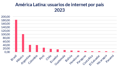
Fountain: Statista Research Department – Latin America: internet users by country 2023
With this graph we can interpret trends such as access to technology and connectivity in the countries. Additionally, it could highlight disparities in Internet access between different countries. These data also extrapolate the amount of population in each country. And so we could continue seeing more interpretations.
What are bar charts used for?
Bar graphs are used to compare data between different categories. In addition, they allow easy comparison and analysis of trends in the data. In this way, the main functionalities of bar graphs are:
- It serves to view the data in a simple and direct way to simplify its interpretation.
- Visualize recurring trends or patterns to make decisions
- You will be able to compare data variables that may be very different.
Bar Chart Features
The bar graph is made up of the following basic elements. Namely, these are the elements that make it up.
Qualification
The title is a descriptive phrase what is on the top of graph. That is, you need to summarize what the chart is about to understand the purpose of the chart. Therefore, The title must be visible, clear, concise and descriptive.
Bars
The bars represent categories or data sets. The height of each vertical bar or the length in each horizontal bar indicates the frequency or value of the category it represents. The bars should have a space to compare the different categories.
X and Y axes
It is the way the bar graph is composed. That is how The X axis is the horizontal and the Y axis is the vertical.
X Axis (Horizontal Axis): The X axis refers to the categories of data being compared. Each bar on the graph corresponds to a category and the length or height will represent the value they have.
Y Axis (Vertical Axis): It is the numerical scale that shows the quantities or frequencies associated with each category. The corresponding value is indicated by the length (or height) of the bar.

Types of bar charts
When constructing a bar chart you have a wide variety of data to consider. Among some of them are:
Simple bar chart
It is the most common bar chart where the length of the horizontal axis (X-axis) has the categories and the vertical axis (Y-axis) presents the numerical data. The categories and type of number may vary. The higher the bar, the larger the category. For example, here we see the salaries or minimum wages in Latin America from the highest.
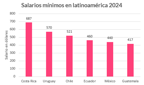
Fountain: Statista – Minimum wages in Latin America in 2024
Horizontal Bar Chart
The arrangement of the axes is reversed, as categorical data is plotted along the vertical axis, while numerical values are plotted along the horizontal axis. Using the same example data as before, it would look like this.
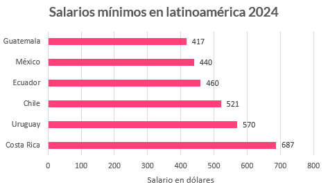
Fountain: Statista – Minimum wages in Latin America in 2024
Clustered Bar Chart
This type of chart is used to graphically represent two or more data series in bars of different colors. Bars from different series are glued together for comparison. For example, in this same graph, we can add an additional variable such as Gross Domestic Product or GDP per capita. In this way, the data would look like this.
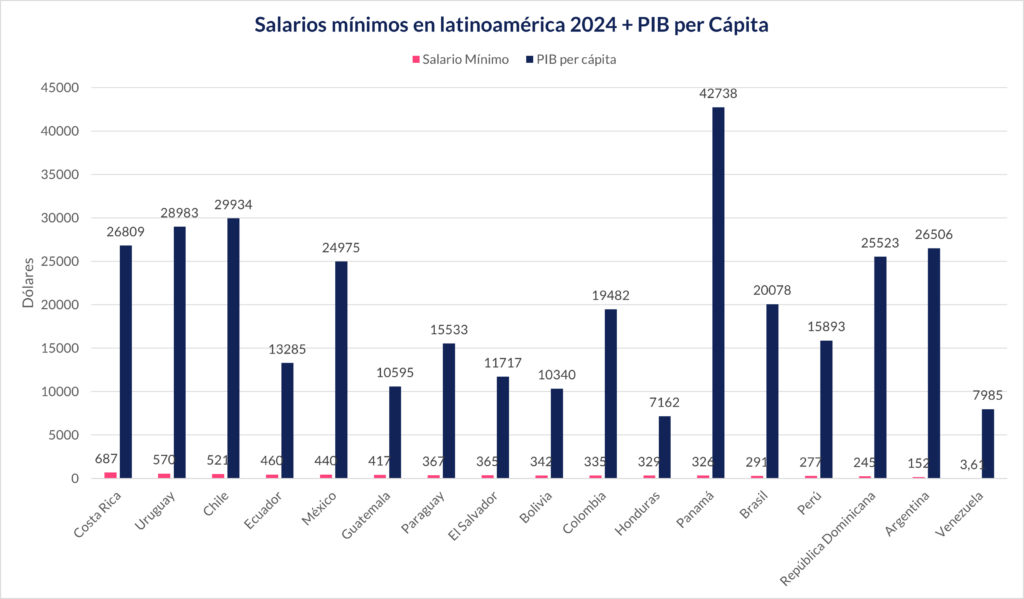
Fountain: Statista – Minimum wages in Latin America in 2024 and Wikipedia – Latin American countries by GDP
Stacked Bar Chart
Here two or more data are represented, but in a stacked way. We will take the example of the ranking of Latin American and Caribbean countries by inflation rate. Here we have the same data in different countries, but from different years. This way, in a stacked bar chart, the ranking would look like this.
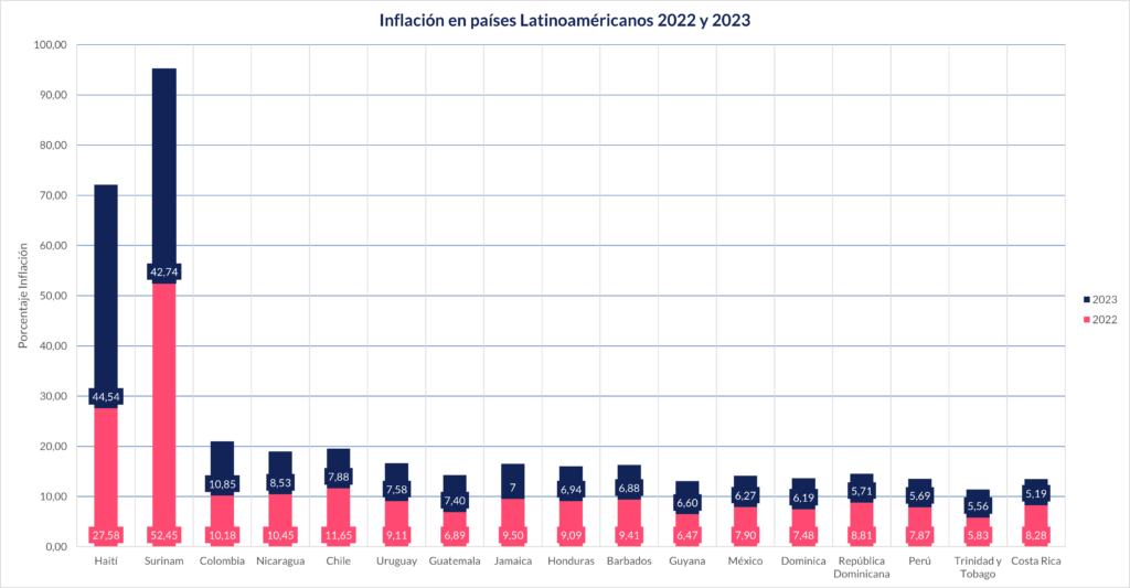
Fountain: Statista – Ranking of Latin American and Caribbean countries by inflation rate in 2022 and 2023
Special Bar Charts
These types of graphs are useful for doing better analysis. Some types of these bar graphs are:
Histogram Charts
Shows the frequency distribution of a data set. In a histogram, the base of each bar represents a class or range of values. Meanwhile, the height of the bar represents the absolute quantity or frequency with which the value of each class occurs.
Histograms are useful for visualizing the distribution of continuous, quantitative data. Additionally, it helps identify trends, centrality, range, and symmetry in the data.
Combined Graphics
These two or more types of graphs in the same visualization. For example, you can combine a bar chart with a line chart. Combo charts are useful for seeing similarities or differences between multiple data series. Let's go back to the example of the relationship between minimum wages and GDP per capita in Latin America. Leaving one of these data in a line graph helps us understand the variation of the data.

How to make a bar graph?
To make a bar graph you can follow the following steps:
1. Collect and organize data that you want to display in the graph, identifying the categories and numerical values.
2. Choose the type and orientation of the bar chart. As we mentioned before, this will depend on the goal you want to achieve with the graph. You must decide what type of data will go on the X axis and the Y axis. Also, consider whether you are going to include additional data.
3. You can create the chart in multiple tools. Some software and graphic design platforms are available on the market such as Canva, Miro, LiveGap, Rapid Tables or Adobe Express. However, it is recommended to use platforms such as Microsoft Excel, since this way you will create a graph more quickly.
4. Bar Chart Design. Adjust the size, color, style, and position of bars, as well as axes, scales, and chart titles.
5. Review and verify that the graph is clear, accurate and attractive. In addition, you must ensure that the data is reflected.
How to make a bar graph in Excel?
If you are using Microsoft Excel, these are the steps to make a bar graph:
- Open Microsoft Excel: If you do not have it installed or purchased, you can also use the online version of Microsoft 365 to find out.
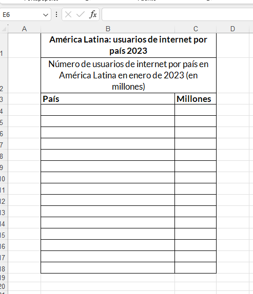
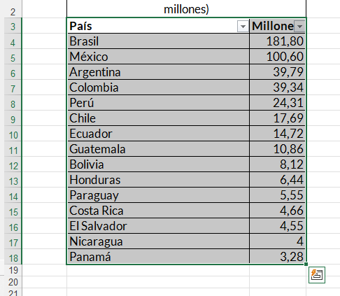
- Add categories or labels for the chart's X and Y axes: In Excel we suggest you create a table with the data to create the graph. In the following example, in cell B3 we leave the “Country” category as the X axis and in cell C3 the “Millions” category.
- Enter data for the X and Y axes of the graph: In the respective column, you must enter the number or word that corresponds per cell. This way it will be applied to the X or Y axis that you need a number or word in column B or C or the one in which we are using the data.
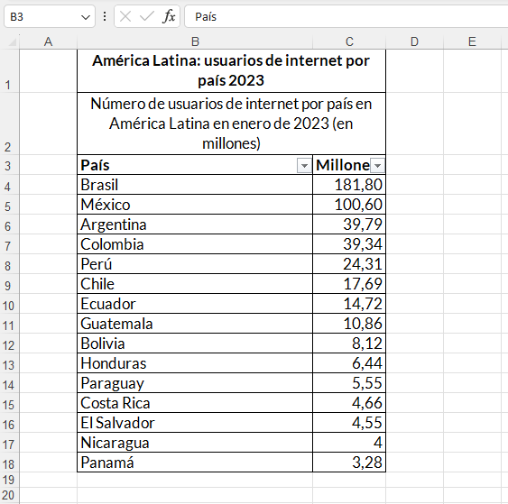
- Finish entering your data: Only with all the complete data will you be able to make your graph in Excel.
- Select all your data: To do this, click on the corresponding cell, hold down the ⇧ Shift key. Then, click on the bottom value in column C. This is one of the ways you can select all the data.
- Click the Insert tab: It is in the Toolbar to the right of the Home tab.
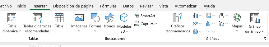
- Go to the group of icons called “Graphics”: In this group you have many graphics options. However, we will look at the bar chart options that exist.
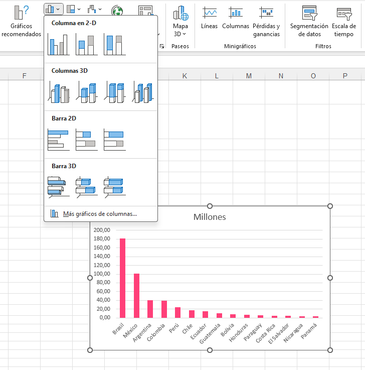
- Choose the type of bar graph: In Excel you have a wide variety of bar graphs to make. For example, grouped columns to compare values between categories. By hovering over the type of chart that is available, you will be able to see the options you have.
You can also see a preview of the bar chart in Excel. This even without needing to create the bar. From this, you can know if the graph solves what you expect.
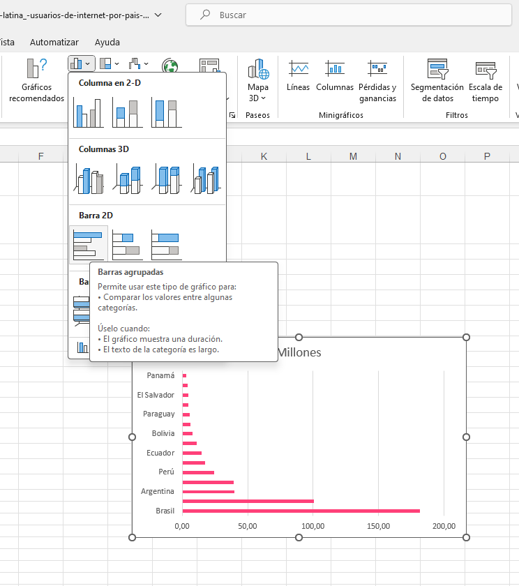
- Customize the appearance of your chart: Once you decide on a chart format, you can use the “Layout” section in the Excel part of the window to select a different template, change the colors used, or change the chart type entirely.

Bar graph example
If we are based on a particular topic, we have multiple bar chart ideas to make. We can review these examples:
- Energy consumption in different sectors according to country
- Compare energy consumption in various sectors such as residential, industrial and commercial. This can shed light on how energy use is distributed in a region.
- Literacy rates by continent or country
- Analyze literacy rates in different geographic regions or countries.
- Age distribution in the population
- Represents the age distribution in a population with a bar graph. This can be useful for understanding the demographics of a region.
- Happiness indices by country
- Use happiness index data to compare different countries. You can graphically represent how these indices vary and what the most influential factors are.
- Government spending by sector
- It shows how government spending is distributed in areas such as health, education, defense, etc. This can offer insight into the government's priorities.
- Access to technology
- You can compare the Internet connection in different countries or regions. Also figures of telephone numbers created by country. Another figure to compare may be internet access according to rural or urban areas. This can be useful in understanding the digital divide.
- Human Development Indices (HDI)
- With the Human Development Index graph, they will combine indicators such as life expectancy, education and per capita income.
- Income Distribution
- Analyzes the distribution of income in a society, showing the proportion of income that goes to different strata of the population.
- Price comparison of Goods and Services
- Compare the prices of a basic basket of goods and services in different cities or countries. You can highlight significant variations.
Frequent questions
What is the bar graph?
The bar graph is a way to represent data, values or other types of data that are related between certain variables. The bar graph can be made in vertical or horizontal bars. The length of the bars is always proportional to the data included.
What is a graph and what is it for?
The graph is a visual representation of the data. This is how the graph represents the variation and behavior of one or more variables according to the available information. This can be done in relation to a time frame or other type of data.
How do you use the bar graph?
To use a bar graph you must consider the variables that you will use in the X axis and the Y axis. Here we present two examples so that you know how to properly use a bar graph.
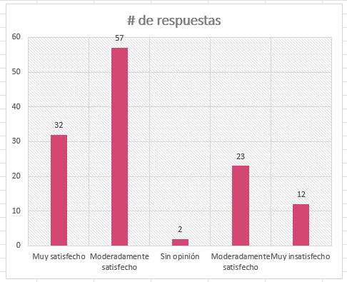
Satisfaction surveys. Based on a previously agreed qualification, a survey can be conducted according to the response variables: Very satisfied, moderately satisfied, no opinion, moderately dissatisfied or very dissatisfied. These variables will be on the x axis. Meanwhile, the response number according to variable will be in the Axis y. This is how in this example of how to use a bar graph the following would look like: