How to make a control board or dashboard in Excel? + Free spreadsheet

Still don't know how to make a dashboard in Excel? Have you tried to learn on your own and can't create a board that works? Don't worry, Excel may be a true wonder for data analysis, but Its learning curve is one of the steepest..
However, you don't need to go through it on your own, because in this post we will explain how to make a dashboard in Excel easily. If you are one of those who needs to create sophisticated dashboards in Excel, keep reading.
Of course, before starting to talk about the entire procedure, you must be clear about what a dashboard in Excel and what it is for. Let's get started!
What is a dashboard or control panel in Excel?
A dashboard is an information organization, control and analysis tool that allows gathering data from visual way to track key metrics and evaluate the performance of a particular project, process or business.
As one would expect, Excel is capable of creating its own dashboards, and given its versatility, dashboards in Excel can have everything from tables to dynamic graphs and formulas that automatically calculate certain metrics.
What is the use for? dashboard in Excel?
A dashboard in Excel it is used to summarize, monitor and analyze large volumes of data. Which, in turn, facilitates the evaluation of the performance of a project or process according to a set of key performance indicators (KPIs).
Thanks to the crossing of data in Excel and the implementation of formulas and dynamic tables, the dashboard Excel greatly facilitates data analysis and monitoring, as well as improves the precision of the results.
Features of a control panel in Excel
The dashboards in Excel can vary greatly depending on the metrics and data they collect. However, they all have the following characteristics in common:
Custom KPIs
The key performance indicators (KPIs for its acronym in English) are metrics that vary from one company to another, since each project has different goals and data.
Visually attractive
The dashboard in Excel are visually appealing because they rely on visual elements to summarize data, reflect key metrics, and summarize information. And it is easier to understand a bar graph than a table full of percentages and numbers.
Practical to understand
A control panel should always be easy to understand, after all, the idea of using a dashboard is to summarize complex information and data in a more visual and understandable way.
Updated
Every dashboard must have up-to-date data and metrics. There is no point analyzing a company's performance with old information. For a dashboard in Excel to be truly useful, it must have updated data.
How to do an dashboard in Excel from scratch?
Create a dashboard in Excel is relatively simple, however, many who do not fully know how to do a dashboard in Excel they skip crucial steps or do not perform them in the correct order.

To avoid confusion, we tell you how to make a dashboard in Excel from scratch.
Define the objective of the dashboard or control panel
The first thing is to establish the objective of your control board. What metrics do you want to evaluate? What data do you want to include? What questions do you need to answer? Depending on that, the board will gather certain information and discard other information.
Create database in Excel
The second step to create a dashboard in Excel, is to make the database of your control panel. To do this, you must add a sheet to your Excel file, in that sheet you must create a table with all the information that you will need to reflect in your dashboard.
Create pivot tables
Once you have your database, it is time to create the dynamic tables of your dashboard in Excel. The pivot table will summarize key database information and metrics that you made earlier. To create it, click Insert in the top panel, and then click the PivotTable option.
Create dynamic charts
Once you have defined your dynamic tables, you can create dynamic graphs that reflect their information visually and are updated with each change in the tables or database. To create dynamic charts in Excel, press the Insert option and then Dynamic Chart.
Define and highlight KPIs
Don't forget to define and highlight your KPIs with the appropriate format. You can represent them in your Excel dashboard as large, visually appealing boxes or cards. Creating them is simple, press Insert in the top panel, then click on the Shape option and in the cell of the shape you have created, place the “=” sign followed by the name of the cell you want to highlight.
Insert slicer and timeline
Data segmentation in Excel is one of its great advantages. Applying it is simple: select the pivot table whose data you want to segment, then, in the PivotTable Tools panel, follow the path: Analyze > Insert Data Slicer path: PivotTable Tools > Analyze > Insert Timeline.
With this, you will be able to segment certain metrics, extract them and reflect them promptly on your dashboard.
Design the dashboard
The design is the final touch of your dashboard in Excel. The idea is that it clearly shows the most important metrics and is easy to understand. In this sense, remember that each visual and graphic touch-up must give priority to the main objectives of the dashboard.
Examples of dashboard in Excel

To understand everything you can do when creating dashboards, there is nothing better than taking a look at a couple of examples. Let's look at some models of dashboard in Excel:
Dashboard sales in Excel
A dashboard Sales report is a type of dashboard that is used to evaluate the commercial performance of a business through sales-related KPIs. It typically gathers and monitors metrics such as the number of sales in a time interval, the volume of returns, or sales profit.
Dashboard of production
He dashboard Production is a control panel designed to monitor the production of a company or business. Therefore, it gathers and monitors indicators such as production costs, company productivity, product delivery rate, etc.
Free download: Worksheet Dashboard From Human Resources
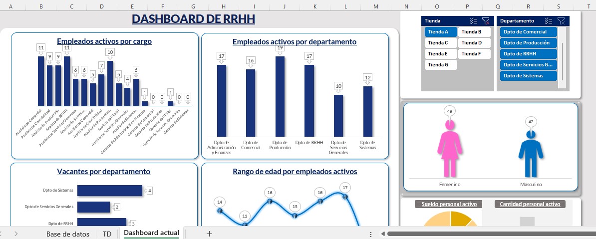
A human resources dashboard manages metrics related to internal functioning of a business, so it evaluates KPIs such as the performance of each worker, their skills, training, etc.