Histogram in Excel: master frequency polygons

Key information
A HISTOGRAM It is simply a visual representation of the times a group of events occurs. It is similar to a bar graph, where each bar represents the frequency at which what you want to measure occurred. For example, in the scores of a group of students, you can see how many scored above 90%, how many scored between 80% and 90%, and so on.
The basics
Data set: Histograms are made on a set of data. The idea is that there are enough of them so that the histogram can faithfully represent the frequencies: if there is little data, it is more likely that each event occurs very few times or not at all, so the graph does not provide much information. Categories do not have to be numbers, but can also be words.
Interpretation: Each bar indicates the number of times a certain event or set of events occurred. If one bar is higher than another, then that event occurred more times than the other.
Advantages: It is a quick and convenient way to summarize information and interpret data. If you have the latest version of Excel, it is also very easy to do. If this is not your case, don't worry! Here we tell you step by step how to achieve a histogram in Excel regardless of the version you have of the program.
Step 1: Select the data.
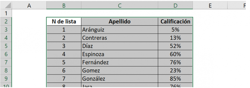
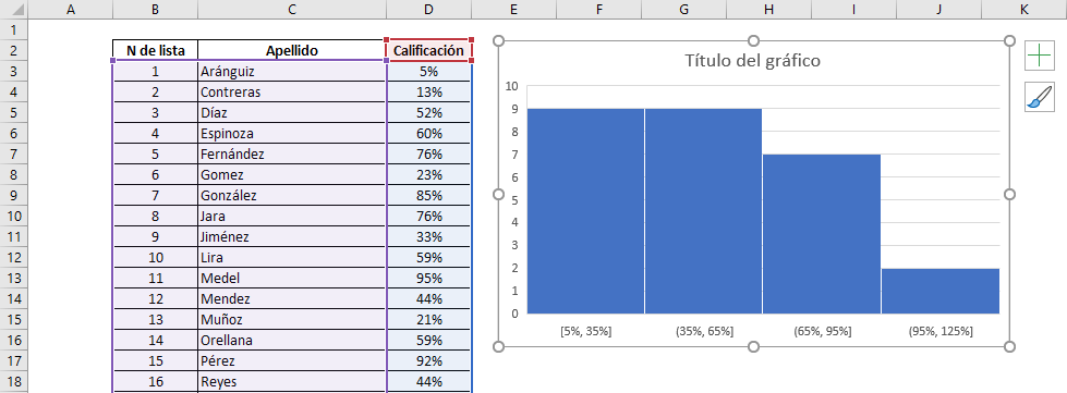
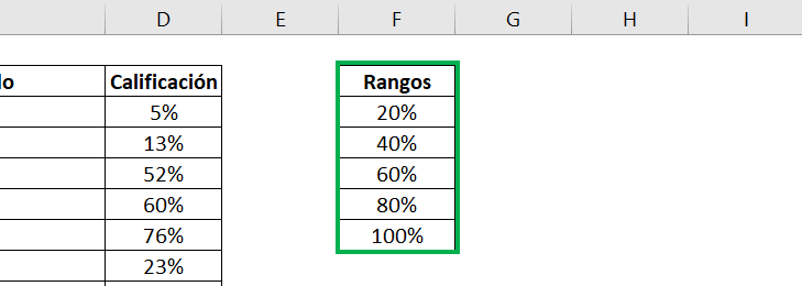
Consider the following course list with student grades:
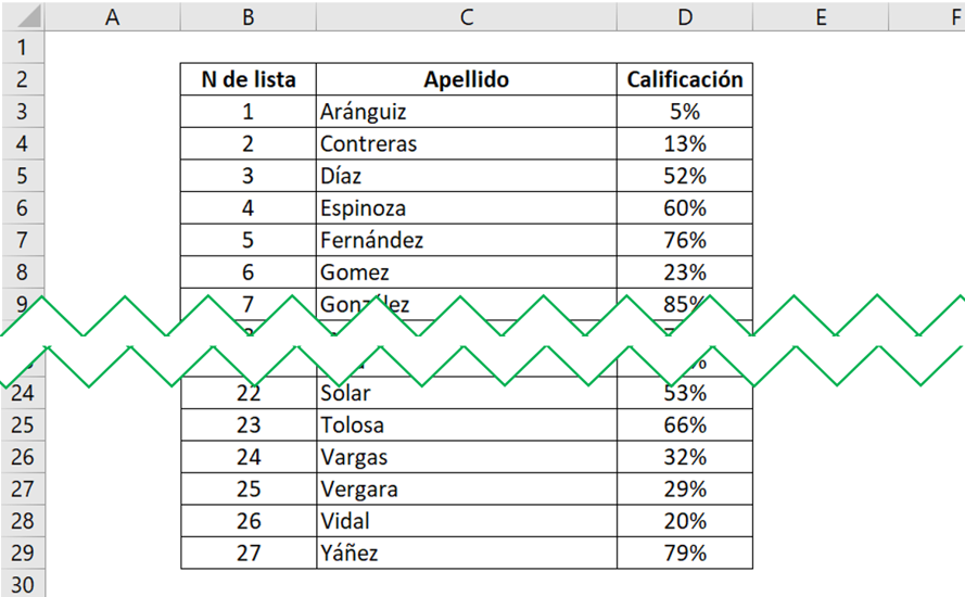
Select the entire database where you have the information:
Ninja Tip: You can select cells with keyboard shortcuts, holding down the SHIFT key and moving with the keyboard arrows.
Step 2: Insert your histogram into Excel
Go to the “Insert” tab on the toolbar, and in the “Charts” section select the histogram or statistics graph icon.
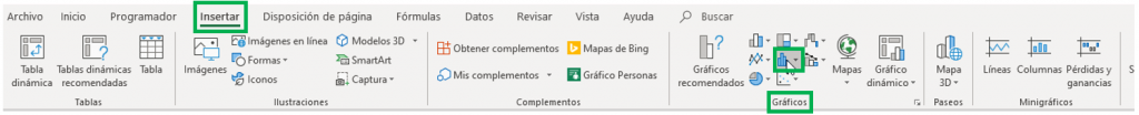
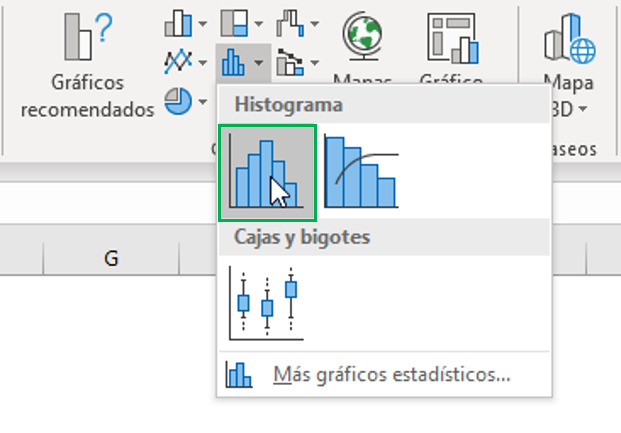
When you click, two options will appear, and you must select the first of the “Histogram” options.
You will see that a histogram will automatically appear in your Excel spreadsheet.
Step 3: Customize and design your histogram.
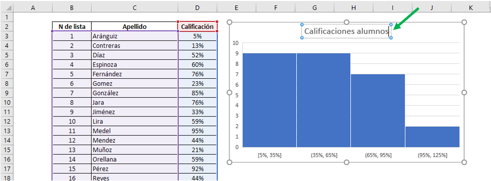
First, double click on “Chart Title” to edit it. Notice that the outline of the box containing the title becomes a dashed line. Choose the one you want. In this case, we will leave “Student Grades”.
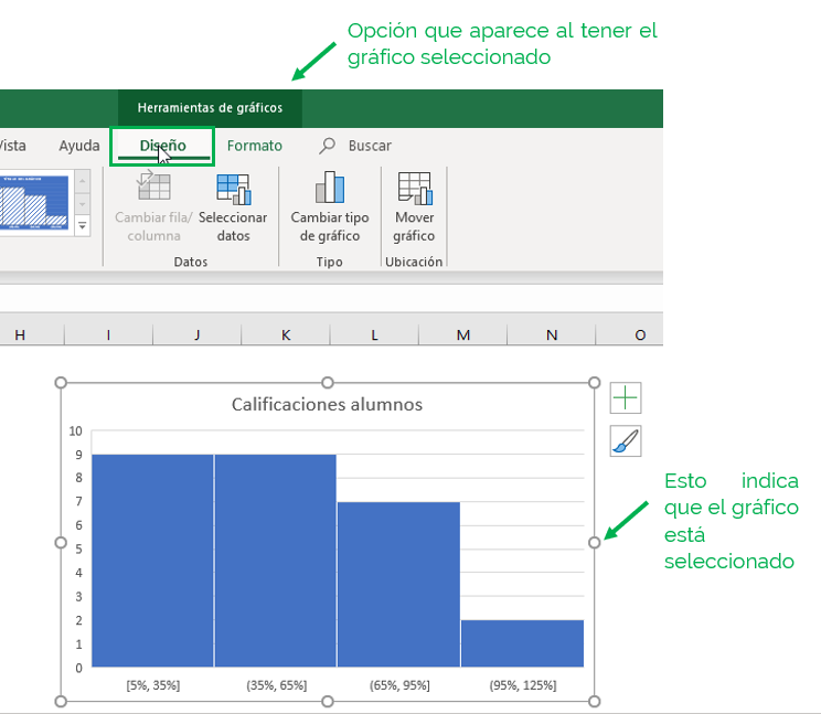
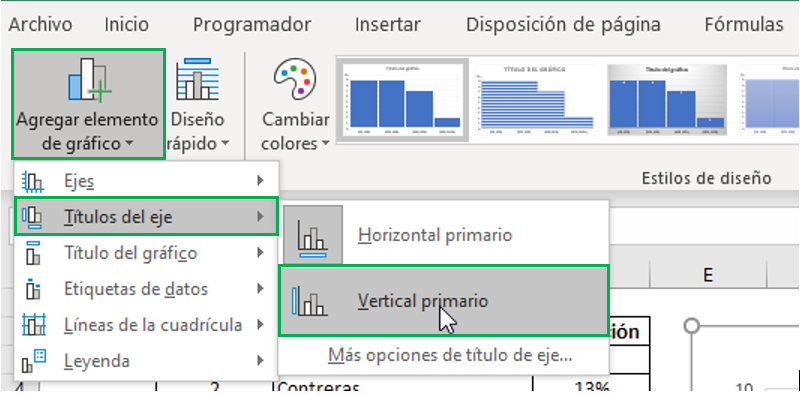
We will also add titles to the axes to know what each one corresponds to. Make sure your chart is selected and click on the “Design” tab in the toolbar. You will see that it is just below “Chart Tools”, which only appears when you have this element selected in the spreadsheet.
On the left of the tab, select “Add Chart Element” and then “Axis Titles.” You will see that you can select to add a horizontal title or a vertical one. We will first select “Primary Horizontal”.
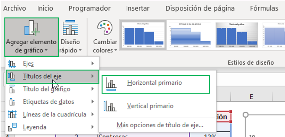
Repeat the process again, but now selecting “Primary Vertical”.
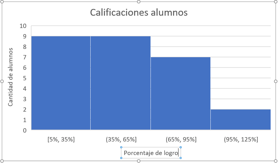
We see that the graph now has two axis titles, located horizontally and vertically.
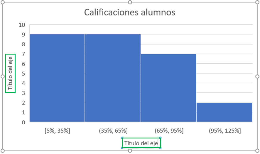
Double click on each one to edit the content.
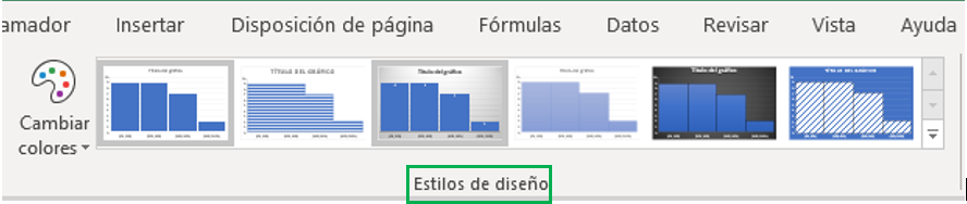
You can also change the colors and style of the histogram in the same “Design” tab, in the “Design Style” section.
So far we have seen the most basic form of the histogram, and it leaves almost everything in the default form that Excel automatically returns. You may want to make many more changes after this, which we will see below.
Modify the ranges
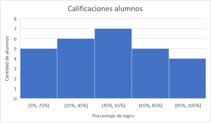
Ranges are nothing more than an elegant way to call the “bars” that form in the histogram. You may want to have more or fewer ranges, or you may want to define the width of each one. For example, in the chart above we had four ranges, each with a width of 30%. You may want to have the information a little more disaggregated, so you could define more ranges or a smaller range width.
Step 1: Right click on the chart and select “Format chart area”.
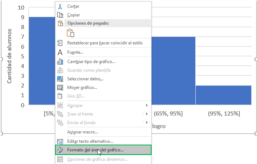
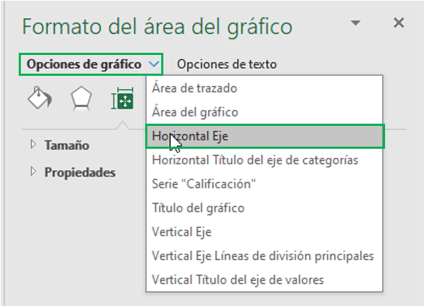
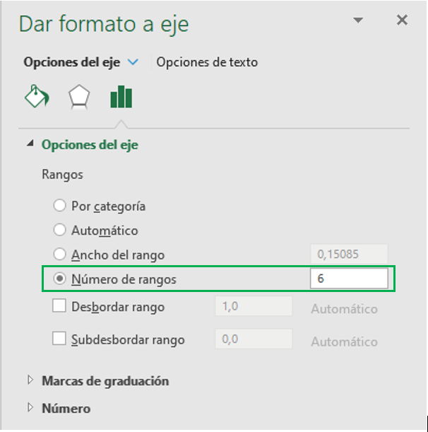
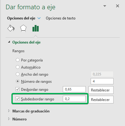
Step 2: A panel will appear on the right of the screen to configure your chart. Click “Chart Options” and then “Horizontal Axis.”
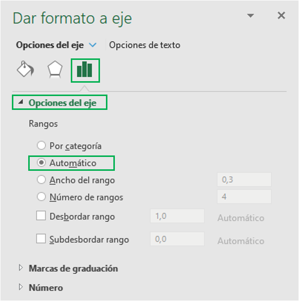
Step 3: Click on the icon with vertical bars, and then on “Axis Options” to display the list of options. The default range is “Automatic”, that is, Excel does all the calculations for you.
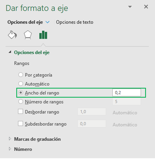
You can select “Range Width” and specify how thick you want each of your bars. For example, you can indicate that you want a width of 20%.
The result is as follows. If you notice, there is a difference of 20 percentage points between the upper and lower limit of each range, leaving five bars in total.
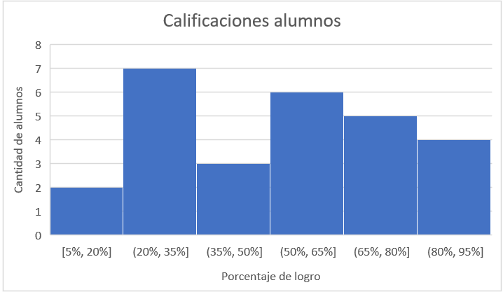
You can also select “Number of ranges”, which defines how many bars you want in your histogram. For example, six ranks instead of four.
Leaving the following histogram:
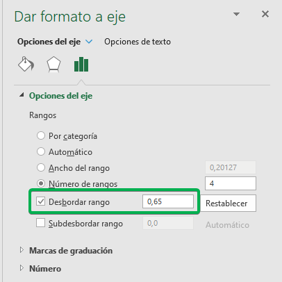
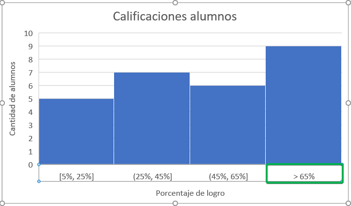
Perhaps you noticed that under the “Number of ranges” option there are two boxes that you can check: “Overflow range” and “Underflow range”.
The first case (“Overflow range”) is used so that the last range contains from a lower limit to all numbers greater than this. For example, we want the last range to have all cases that scored more than 65%.
The result is as follows:
The second case (“Underflow range”) is the same case for the first range, that is, for it to contain all the values up to an upper limit. For example, we want the first range to contain all cases that scored less than 20%.
This is how the histogram looks:
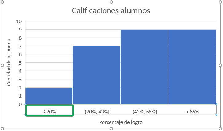
Note that both options can be active, and that they can also be combined with both the “Range Width” and “Number of Ranges” options.
Category Histogram
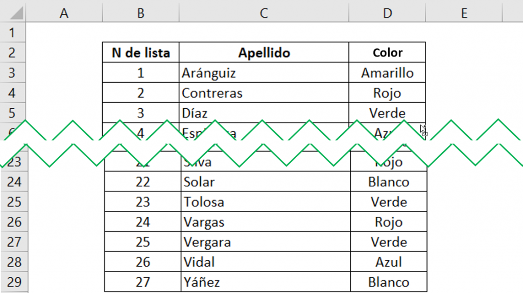
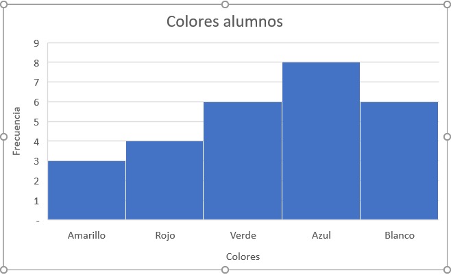
The ranges configuration contains another alternative that we have not reviewed yet, which is by category. This applies when you want to graph the frequency of data that does not contain numbers, but rather text. For example, instead of grades, we could have a list of students' favorite colors.
Step 1: In order for Excel to correctly interpret the text information to make a histogram, it is necessary to add a previous step to the case with numerical data. You simply have to add a new column that contains “1”, and which we will call “Auxiliary”.
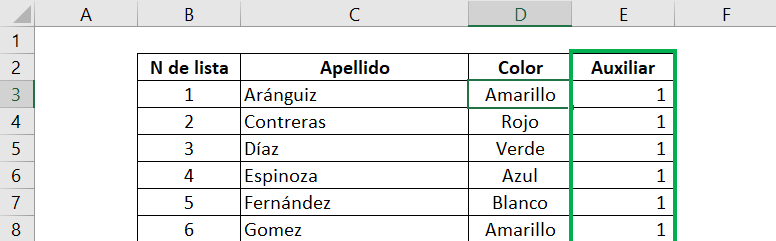
This column will allow you to add up the number of times each of the colors appears.
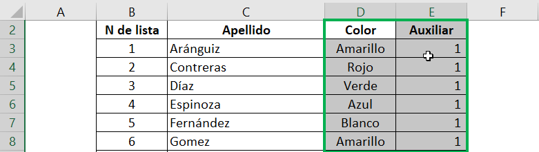
Step 2: Select only the column with the categories you want to graph (“Color”) along with the “Auxiliary” column.
Step 3: Repeat Step 2 at the beginning of this post to insert the histogram.

The result is as follows:
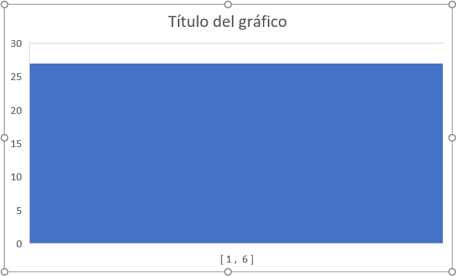
Clearly this is nothing like what we're looking for, but no problem, there's still one step left!
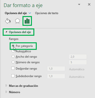
Step 4: In the Chart Area Format panel, you must select “By Category” so that Excel can understand that your histogram has text instead of numbers.
And ready! After modifying the main title and the axis titles, the histogram finally looks like this:
Using the Analysis Tools Package (for older versions of Excel)
If you don't have the latest version of Excel (2016), you can use the data analysis package to achieve the same goal.
Installing the data analysis package
Step 1: In the toolbar, click “File” and then “Options” (in the lower left corner).
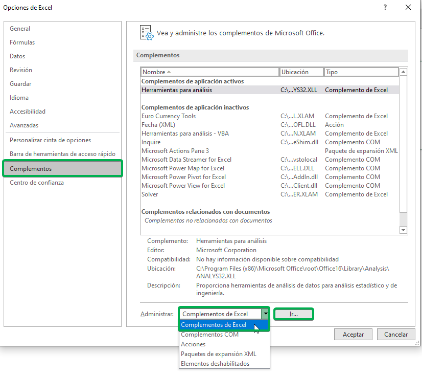
Step 2: In the new options window, you must select “Add-ons”. In the “Manage” section, select “Excel Add-ins” and then click “Go.”
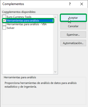
Step 3: A new window will appear, in which you must check “Analysis Tools” and then click “OK”.
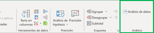
If you go to the “Data” tab in the toolbar, you will see that a new section called “Analysis” has been added.

Inserting a histogram
Let's go back to the case of the initial base with student grades. The “Data Analysis” tool needs us to give it a little more information before inserting the histogram.
Step 1: Add a column with the ranges. Each element in the column indicates the upper limit of each range. That is, you will have as many ranges as the upper limits you have specified. If the last limit is less than the highest value in your data, then Excel will automatically add one more bar to hold the “remaining” data.
Step 2: Go to the “Data” tab and click on the new “Data Analysis” tool.
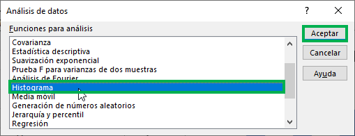
Step 3: In the new window, select “Histogram” and then click “OK”.
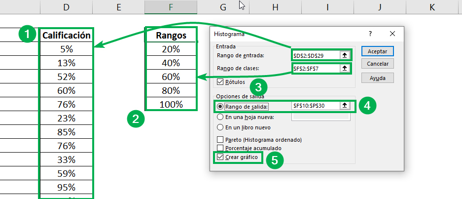
Step 4: Incorporate the elements of your histogram.
- Select the “Ratings” column for “Entry Range.”
- Then select the “Ranges” column for “Class Range”.
- Check the “Labels” box as well since the columns include the headings.
- For the output options, select “Output Range” if you want the histogram to be on the same sheet in which you have the data, and then indicate the cells where you want Excel to output the histogram.
- Before finishing, check the “Create chart” box to have Excel automatically create the histogram. Finally click “Accept”.
You've made it! As you can see, Excel outputs the chart data in a table in addition to the figure. The histogram is ready. All that remains is to fix the design.
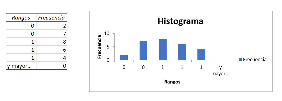
Step 5: Configure the data. In the “Ranges” column of the data that the program returned to create the histogram, select the percentage format. You can also see this in the histogram. You can also later change the titles to have a figure that perfectly fits your needs.
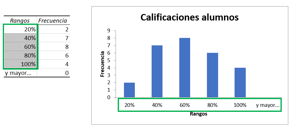
Ninja Tip: If you don't want to have the "and greater..." bar, simply delete the row containing "and greater..." from the table and that will result in the same change in the histogram.
Ninja Tip: If you want to learn and delve deeper into other types of charts in Excel, don't miss this post.
Frequent questions
To create a Histogram in Excel we must select the data and insert a graph, select Histogram and click accept
A Histogram in Excel is a graph that allows us to view columns that show frequency data

Carolina Wiegand
Carolina is a doctoral student in Economics at Yale University and a Business Engineer at the Catholic University of Chile. She works with databases doing applied research on education, gender and labor market issues.