Line chart in Excel: Making it easy to show your information

Key information
Line charts are generally used to represent time series. This means that we are studying a variable that changes over time and we want to see its trend.
You can complement your learning with the following video:
The basics
- Purpose: The line graphs It is a type of graph mainly used to represent data that has a temporal component, for example the evolution of the company's profits over time.
- Characteristics: They present series of data joined by a line, representing the fact that the data has been changing over time.
Inserting a line chart
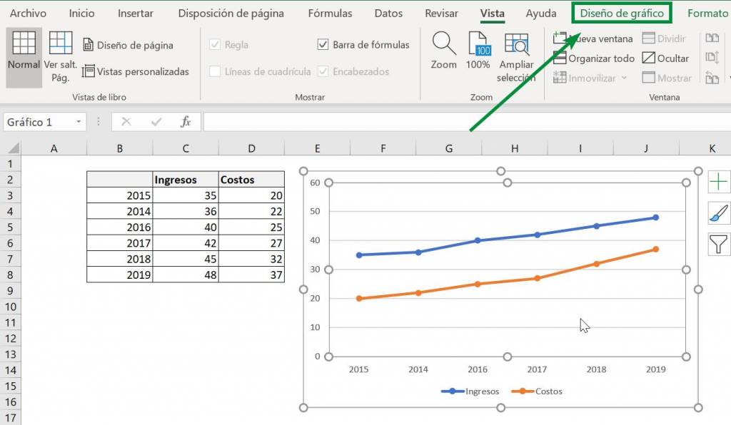
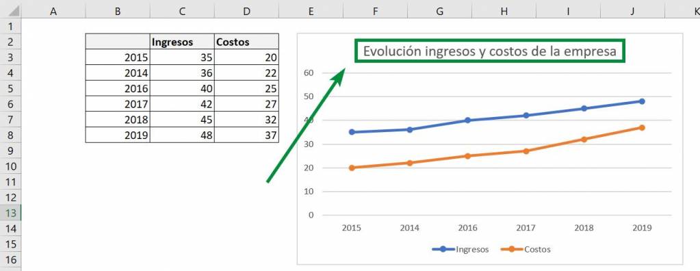
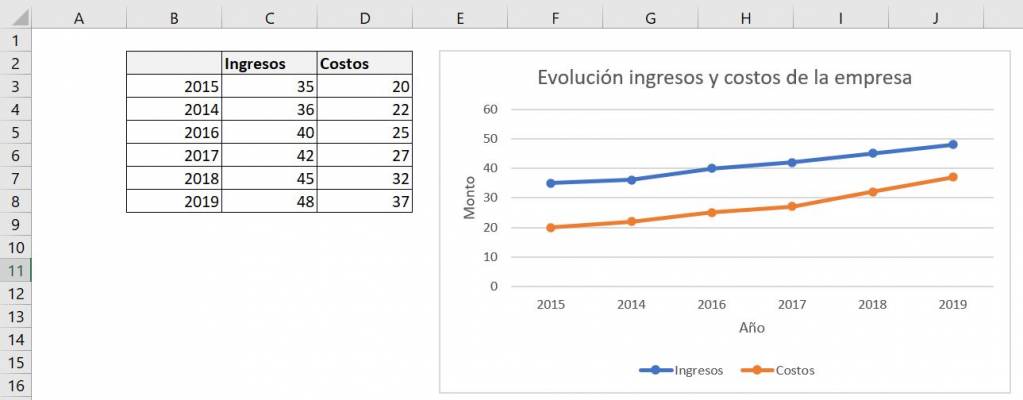
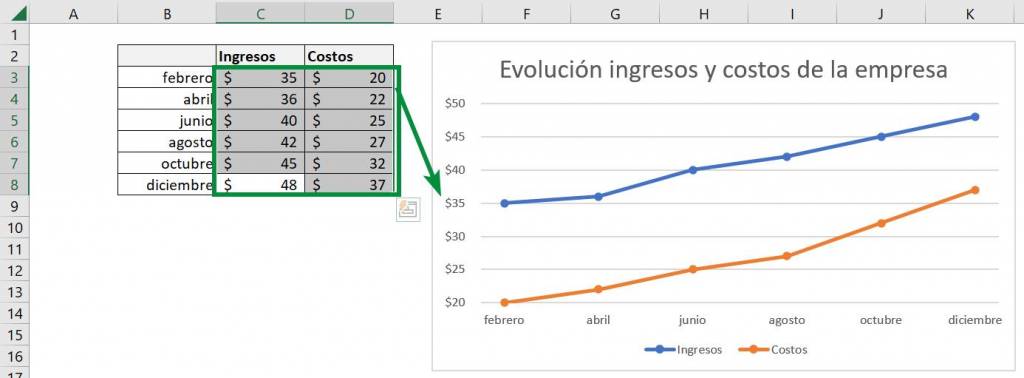
Step 1: The first step to insert our line chart is to select the data with which we want to build our chart. In this example we have the income and costs of a company between the years 2015 to 2019:
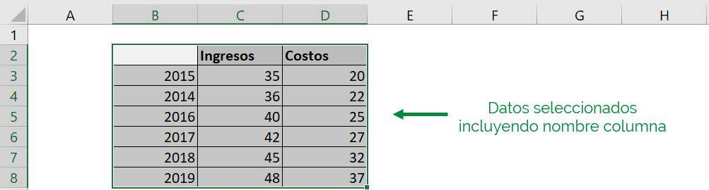
Ninja Tip: We leave the year column untitled so that Excel recognizes it as the time axis and not another data entry.
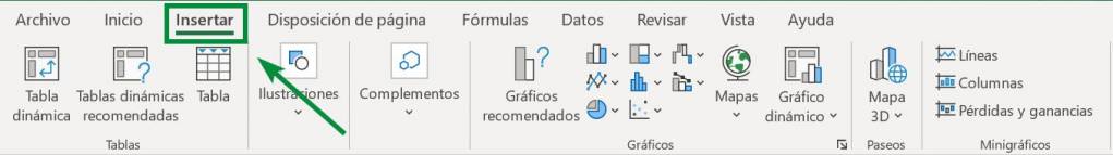
Step 2: After this we go to the main Excel bar and click on “Insert”:
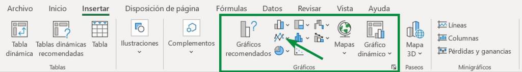
Step 3: We now see that in the “Graphics” section we have different options. For more information about each of these options click here. In this case we select the option corresponding to the line graph:
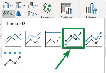
Step 4: Clicking on this option opens a window with different types of line graphs, depending on whether we want the lines to be stacked and whether we want them to have markers (figures in the places where the points are). For now we will use the line chart with markers and without stacking:
With this our graph appears on the sheet we are working on:

We can see that Excel places the years on the horizontal line (X-axis) while the magnitude that the income and costs variables can take go on the vertical line (Y-axis).
Adding titles to the line chart
Main title:
Generally the main title of a line chart comes by default, but if not, you must follow the following steps:
Step 1: We click on the graph we want to edit. This will cause a new option to appear in the main Excel bar, “Chart Layout.” Then we click on that option:
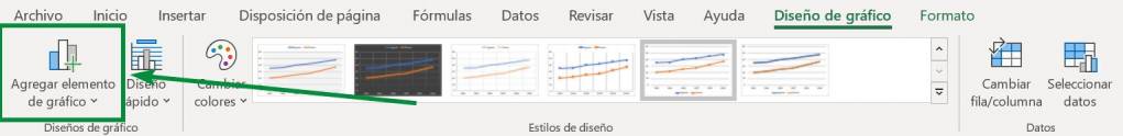
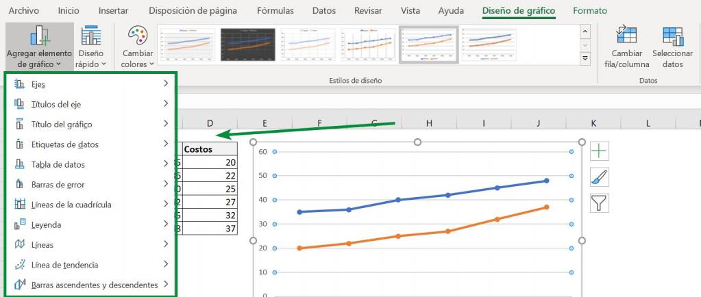
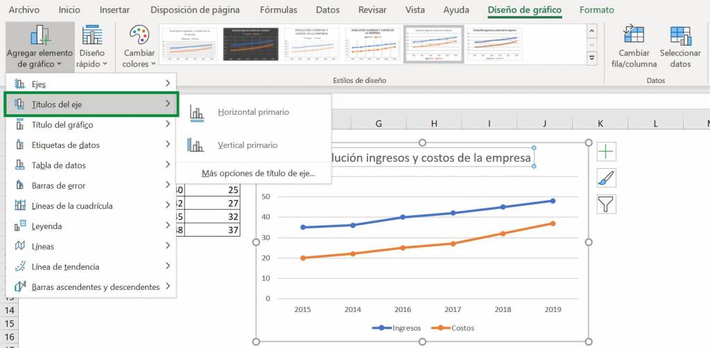
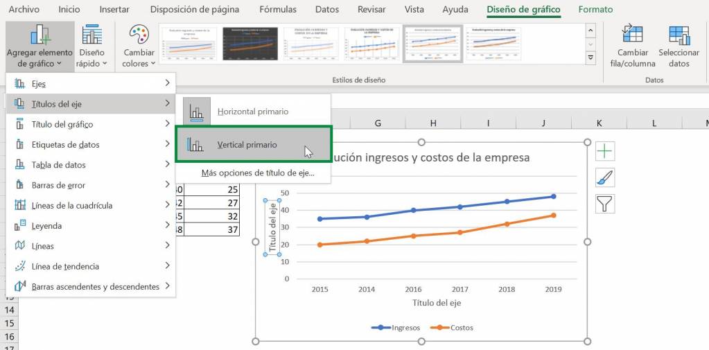
Step 2: Then we click on the “Add chart element” option. This will open a new list with different options:
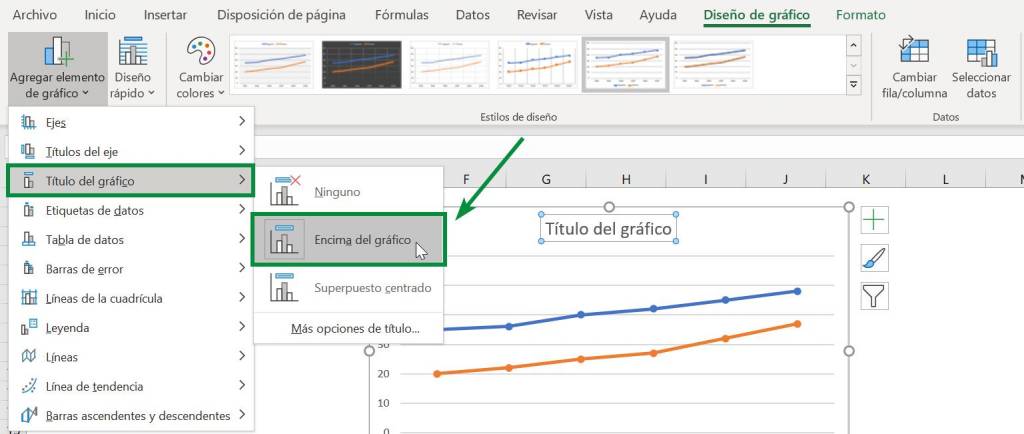
Step 3: Now to add the main title to the line chart we go to “Chart Title”. These present us with different options, in which we select “Above the graph”, with which the title will be just above the space that contains the lines:
Step 4: Now we just need to double click on the title to be able to edit what we want to appear above the line graph:
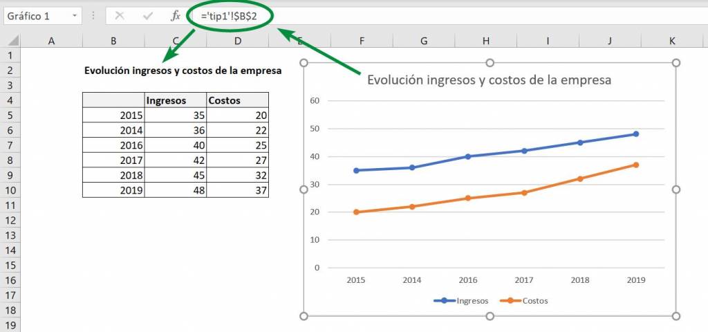
Ninja Tip: We can tell the title to remove text from a cell using the “=” character just as we would do with a traditional function, but making sure that it is written in the function line and not in the title text box:
Axis titles:
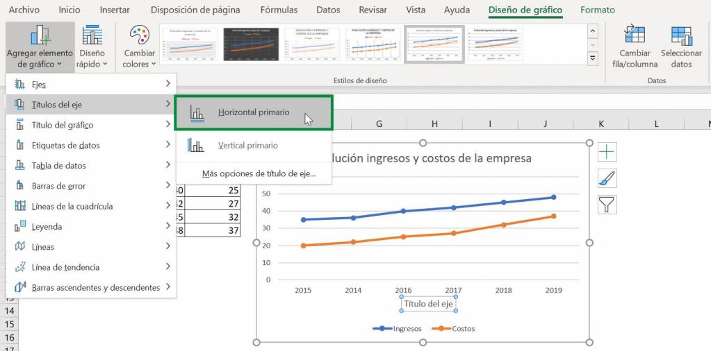
Step 1: Similar to the previous section, to add titles to the axes of our line chart in Excel we go to “Add Chart Element”, but now we go to the “Axis Titles” option:
Step 2: Now we click on the axis option we want to title. Since we want our line chart to have both titles, we repeat the process for both axes:
Step 3: Finally we edit the titles of the line graph by double clicking on them and writing the name we want:
Ninja Tip: By right clicking on the axis title we can access “Axis title format”, where we can adjust the place where the title will be, its orientation and if we want it to have some type of custom angle. You can also access the options by double left clicking.
Adjust the axes of a line chart
When working with a line chart in Excel, the way we present the data is very important, especially when we are showing the evolution over time. Something important in this case is the range of numbers between which the axes move, since this will also affect the size of our lines. To adjust this we follow the following steps:
Step 1: We double click on the axis we want to adjust. This will open an options window to the right of the spreadsheet we are working on:
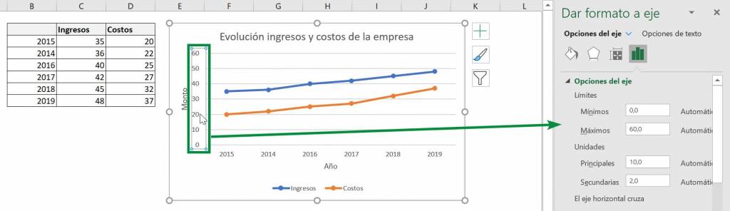
Step 2: Where it says “Minimums” we put what number we want the axis of our line graph to start from, in this case we will put 20, which is the lowest data within income or costs. On the other hand, in “Maximums” we put up to where we want it to go, in which we put 50 to ensure that all the data can be seen in the line graph. Additionally, with the “Main” option within “Units” we can adjust how many units a marker should be displayed on the axis. Here we are going to put 5 since we reduce the axis interval:
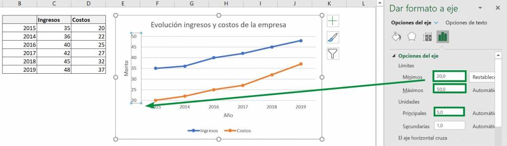
Ready! It's that easy. Additionally, in this window you can adjust other things such as what number the horizontal axis crosses and the units in which the axis is displayed.
Changing the format of the units of a line chart
In a line chart the format of the units in which we are working is very important, as it helps to differentiate whether the data we are using is dates, money or something else. The easiest thing here is to adjust the formatting in the cells where the chart is getting the information. For example, let's go back to the previous example and assume that the data now comes from different days throughout a year:
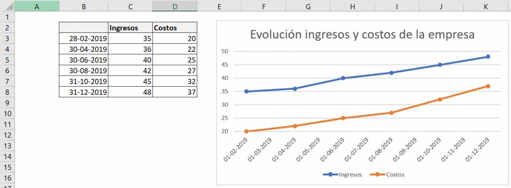
We can see that in this case the date includes the day, month and year, so when we transfer it to the graph the information does not look very organized. Since all the data is from the end of months of the same year, it may be that we only care about the month we are talking about. To fit this in the line chart, we change the column format of the data:
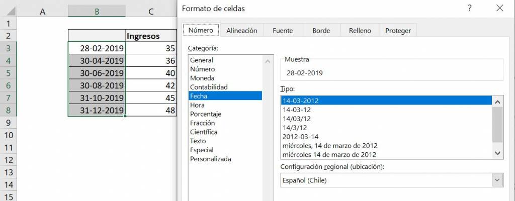
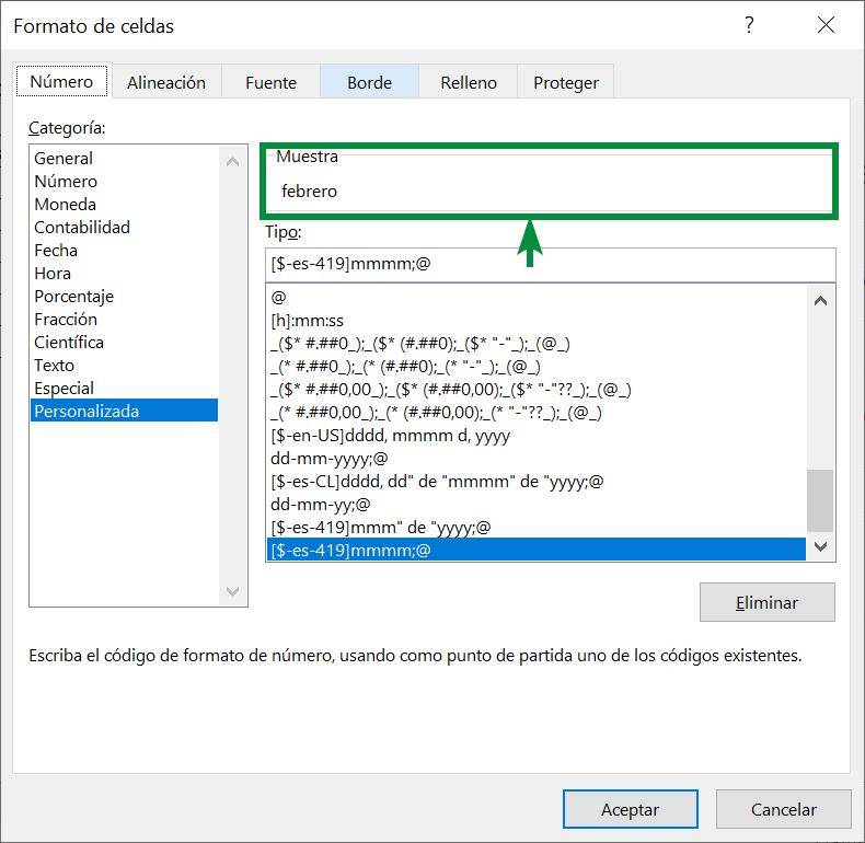
Now we select how we want the dates to appear. In this case we only want the written month to appear:
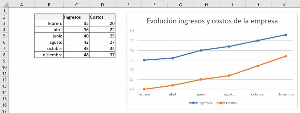
Now we apply the formatting and see that it changes both in the cells and in our line chart:
Additionally, the same thing happens if we add a “$” sign (using the “Currency” format) to the revenue and cost data:
For more tips and information on generating high-impact charts in Excel, click here.

Christopher Diaz
Commercial engineer and Master in Finance from the Pontifical Catholic University. Special interest in topics related to corporate finance, private equity and real estate investment.